Color in a French Mediterranean Living Room
LIVING ROOM
12/15/20251 min read
Color in a French Mediterranean living room is noticed last.
It exists to support light and materials, not to stand out. In steady southern light, every tone reveals itself fully. Wrong choices become obvious; right ones settle quietly. This is why color is applied only after light, proportion, and materials are understood.
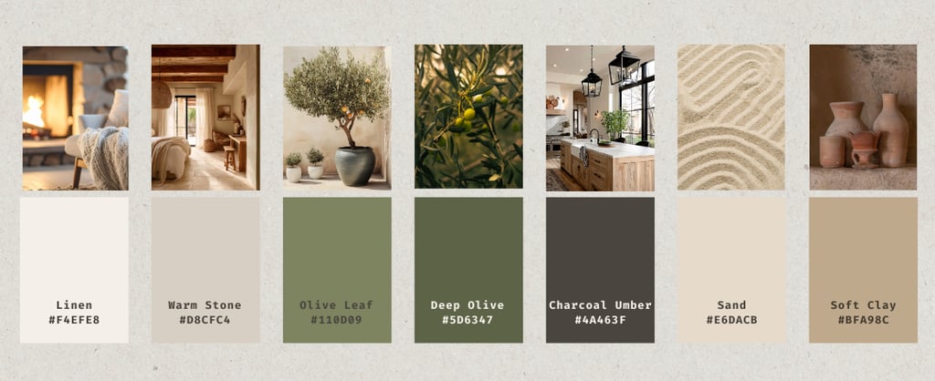
Light-colored bases
Linen (#F4EFE8) and Warm Stone (#D8CFC4) form the foundation of the palette.
These pale, mineral tones reflect daylight softly. They are best used on:
walls
large upholstered pieces
architectural elements
They are never introduced for contrast or decoration. Pure white or sharp contrast appears harsh in Mediterranean light and ages poorly.
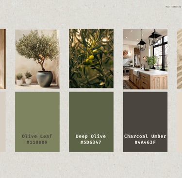
Grounding tones
Olive Leaf (#7E8360) and Deep Olive (#5D6347) provide weight without overwhelming the room.
They belong in:
upholstery
painted wood
ceramics
These tones anchor the space. They do not draw attention to themselves. Used excessively, they dilute their effect.
Depth tones
Charcoal Umber (#4A463F) replaces black.
It creates subtle depth rather than harsh contrast. Appropriate applications include:
furniture frames
tables
architectural details
The goal is visual stability. Charcoal grounds the lighter tones while preserving calm.
Supporting tones
Sand (#E6DACB) and Soft Clay (#BFA98C) occupy the space between light and shadow.
They appear in secondary elements:
ceramics
woven textures
small accessories
Their role is warmth. They are not accents for effect. Too much, and they begin to compete rather than support.
What this palette avoids
High contrast, pure whites, cool greys, and trend-driven colors are deliberately excluded.
These tones rarely survive southern light or time. Mediterranean interiors endure because they avoid the need for constant updating.
How color connects to the room
Color only works when considered alongside:
→ Seating
This ensures that colors do not float in isolation. They respond to light, sit comfortably on materials, and interact with furniture in a way that maintains balance.
A note on selection
Not every hue belongs. Each tone must:
survive steady daylight
enhance material rather than compete
support the spatial composition
If a color needs explanation or justification, it usually does not belong.