Color in a French Mediterranean Dining Room
DINING ROOM
12/16/20252 min read
Color is introduced only once the dining room is structurally resolved.
Light, proportion, materials, and seating establish the room’s balance. Color responds to that balance. In a French Mediterranean dining room, color does not decorate. It supports weight, warmth, and calm under steady southern light.
When color is right, it is barely noticed.
Southern light and color behavior
Mediterranean light is consistent and revealing.
It flattens overly bright tones and exaggerates contrast. Colors that feel subtle in other settings can become dominant here. This is why restraint matters more than creativity.
Colors must sit quietly on surfaces for hours at a time.
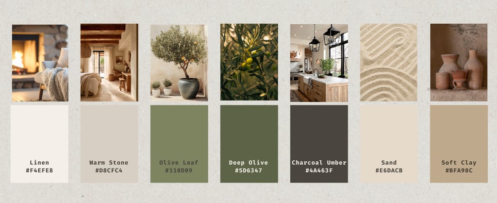
Base tones: reflect without glare
The foundation of the palette belongs to walls, ceilings, and large furniture.
Soft mineral tones work best:
linen
warm stone
pale sand
These shades reflect daylight gently and keep the room open. Pure white appears sharp and rarely ages well in Mediterranean interiors.
The base should disappear, not announce itself.
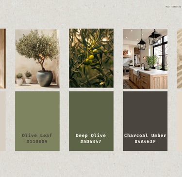
Grounding tones: weight without dominance
Grounding tones add stability to the dining room.
Muted olives, warm browns, and softened earth tones belong here. They are best used on:
dining chairs
sideboards
select wood elements
These tones anchor the room without pulling focus away from the table.
Depth tones: restraint over contrast
Depth is introduced carefully.
Charcoal, deep brown, or near-black tones replace true black. They create definition without breaking the calm. Used sparingly, they add structure to furniture and architectural details.
If depth draws attention, it has gone too far.
Supporting tones: warmth in moderation
Supporting tones bridge light and shadow.
Soft clay, muted terracotta, or sand tones appear in:
ceramics
textiles
subtle details
They add warmth without becoming accents. Color here should feel inevitable, not styled.
What is intentionally excluded
Certain colors consistently fail in Mediterranean dining rooms:
high contrast palettes
cool greys
trend-driven shades
strong saturation
These colors demand attention and age poorly under constant light.
A room that relies on color for interest rarely endures.
Color as response, not decision
Color only works when it follows structure.
Revisit the articles:
→ Light & Proportion define exposure
→ Materials & Finishes determine texture and depth
→ Seating establishes scale and weight
When these are resolved, color choices become limited and clear.
Selection principle
Every color must:
sit comfortably in southern light
support material and form
remain calm over time
If a color needs justification, it usually does not belong.